Go Back

Revamping the Digital Presence- a website design project

Revamping the Digital Presence- a website design project

Revamping the Digital Presence- a website design project

Better viewed from Laptop!! Mobile version of Case Studies is in progress work.

Overview

Overview

Overview

This project is part of my solid 7.5 months internship at ClearFeed. I worked closely with the founders, marketing team and content writers. And I led the design aspect of it. I hope you enjoy reading it.

Approach

Approach

Approach

This case study highlights a strategic website design process, driven by user-centered design, and iterative development. From inception to post-launch refinement, the project showcases a holistic approach for successful outcomes, emphasizing the fusion of creativity and data-driven insights.

Starting with "What does ClearFeed do?"

Starting with "What does ClearFeed do?"

Starting with "What does ClearFeed do?"

It took me multiple onboarding sessions, which were held for all the new joiners, to understand the product completely. To give you a crux, it is a B2B SaaS Product which provides services to those companies which use Slack Connect to provide customer support. ClearFeed helps provide seamless support on Slack, empowering companies to scale confidently. It has customers such as Airmeet, Astronomer, Sprinto, Atlan, Coreweave, Union, etc.

After this, I tried to understand the Brand Positioning

For understanding that, I looked for 3 things. Target Audience, Competitors and Personality Slider.

Target Audience

Competitors

After this, I tried to understand the Brand Positioning

For understanding that, I looked for 3 things. Target Audience, Competitors and Personality Slider.

Personality Slider

Home Screen Brainstorming

Home Screen Brainstorming

Home Screen Brainstorming

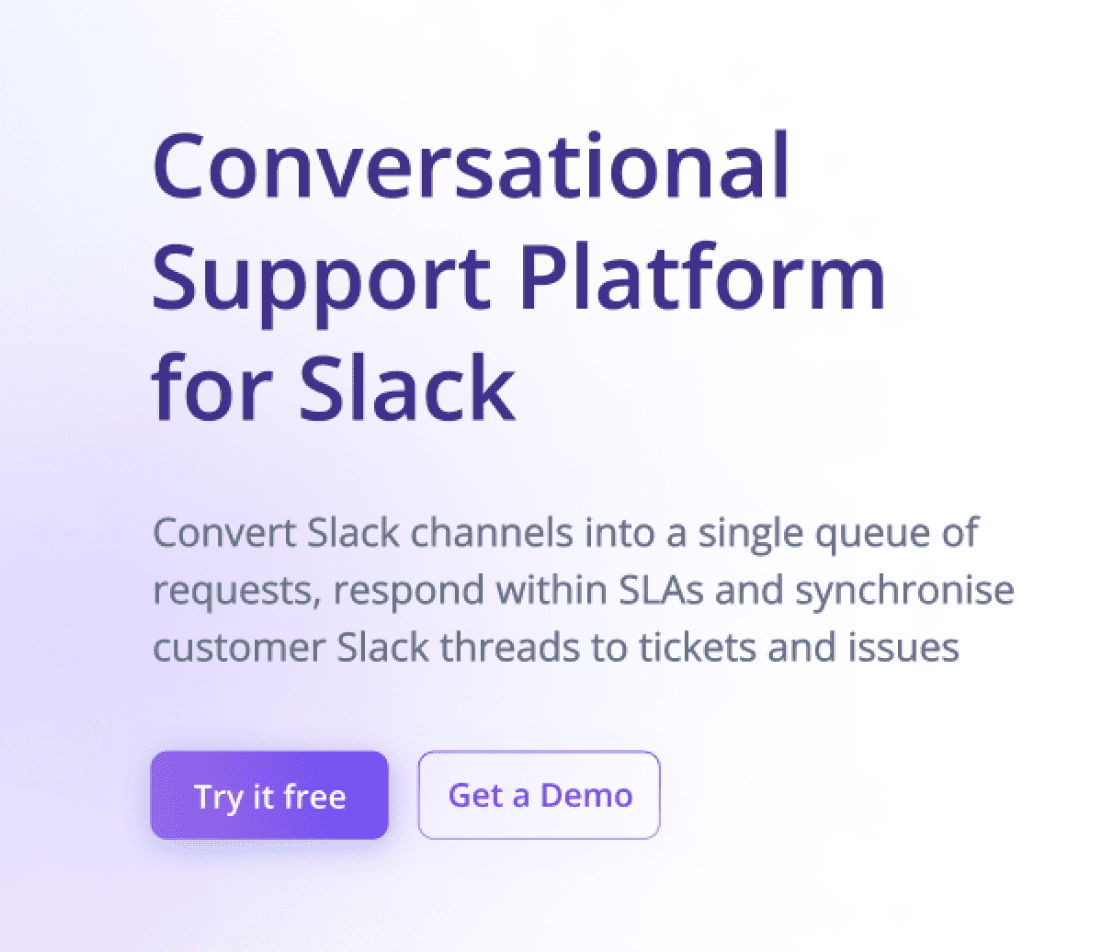
Our previous website luckily had a sound information architecture. So we needn't worry about that and jump directly to the individual pages. Start with the home screen since this is the page that most visitors visit and decide if they want to see more or not. The previous home screen had a lot of issues, and after discussing the problems, we came to this. 


Note: It was created in stages; we picked parts of it and completed them individually. But for a case study, I am showing it all at once.

Before

Before

After

After

HERO SECTION

HERO SECTION

COMPANY LOGOS

BEFORE AND AFTER CLEARFEED

FEATURE 1

LOGOS AND TESTIMONIALS

FEATURE 2

USE CASE 1

FEATURE 3

USE CASE 2

FEATURE 4

USE CASE 3

FEATURE 5

CLEARFEED VIDEO

FEATURE 6

FEATURE 6

WAYS OF USING CLEAFEED

WAYS OF USING CLEAFEED

USE CASE 1,2,3

USE CASE 1,2,3

FEATURES

FEATURES

TESTIMONIALS

INTEGRATIONS

SECURITY CLAIM

SECURITY CLAIM

FOOTER

FOOTER

Thoughts:

The previous version had an extended length of features which were 6 folds. It was noticed that potential customers are not focused on features first. Still, they want to confirm if this software can fulfil their use case and want to make sure that this is a credible and trusted website. Secondly, it needed certain aspects, such as How to use ClearFeed. Also required a mention of integrations, which is an important attraction.

The previous version had an extended length of features which were 6 folds. It was noticed that potential customers are not focused on features first. Still, they want to confirm if this software can fulfil their use case and want to make sure that this is a credible and trusted website. Secondly, it needed certain aspects, such as How to use ClearFeed. Also required a mention of integrations, which is an important attraction.

Made specific changes to some of the individual sections one by one as well, but that would be too much to include for this case study.

Made specific changes to some of the individual sections one by one as well, but that would be too much to include for this case study.

Thoughts

The previous version had long of features which was 6 folds and it was noticed that potential customers are not focused on features first but they want to confirm if this software can fulfil their use case and want to make sure that this is a credible and trusted website. Secondly it lacked certain aspects such as How to use ClearFeed, in which ways one can use and mention of integrations which is an important attraction.


Made certain changes to some of individual sections one by one but that would be too much to include for this case study.

Visual Style Exploration

Visual Style Exploration

Visual Style Exploration

After I was evident with the flow, I began exploring various visual styles. Keeping all the brand attributes in mind(like having a modern feel, fancy looking and so on), I began to explore it. I tried on various themes, some of which included:

Slack Based Theme

Aurora Theme ✅

Gradient Theme

Slack theme was came out boring for us and wasn’t feeling modern

Among Aurora and Gradient, we decided to proceed with aurora theme, since it seemed more friendly and elegant overall.

Decision Making

Home screen final Look

Home screen final Look

Home screen final Look

We have G2 5 Star reviews and became the Product of the Day in Product Hunt Launch. These two shine on the top. We were also awarded several awards by G2. But, well, that's a different story for another time.

Pricing Page

Pricing Page

Pricing Page

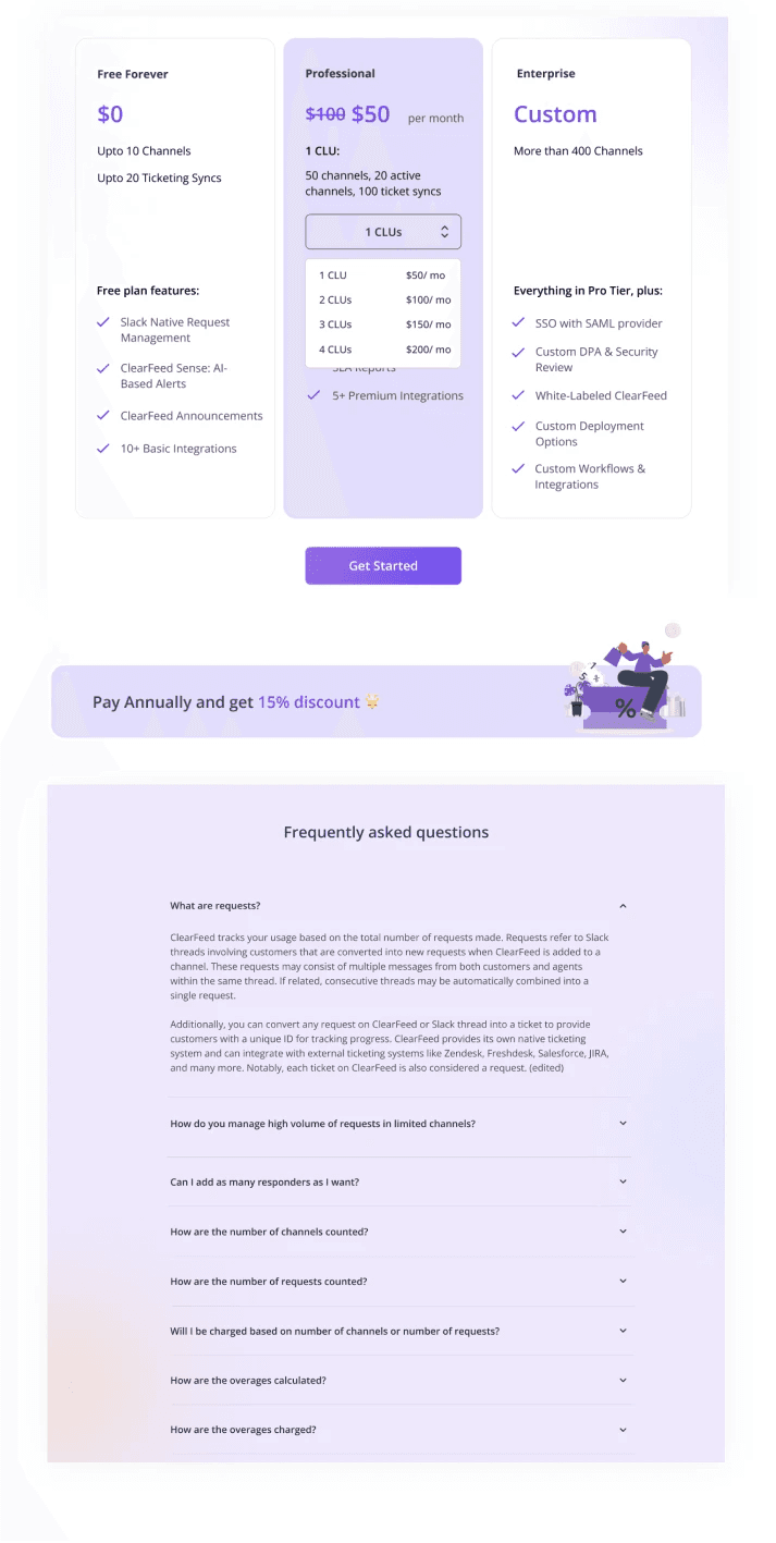
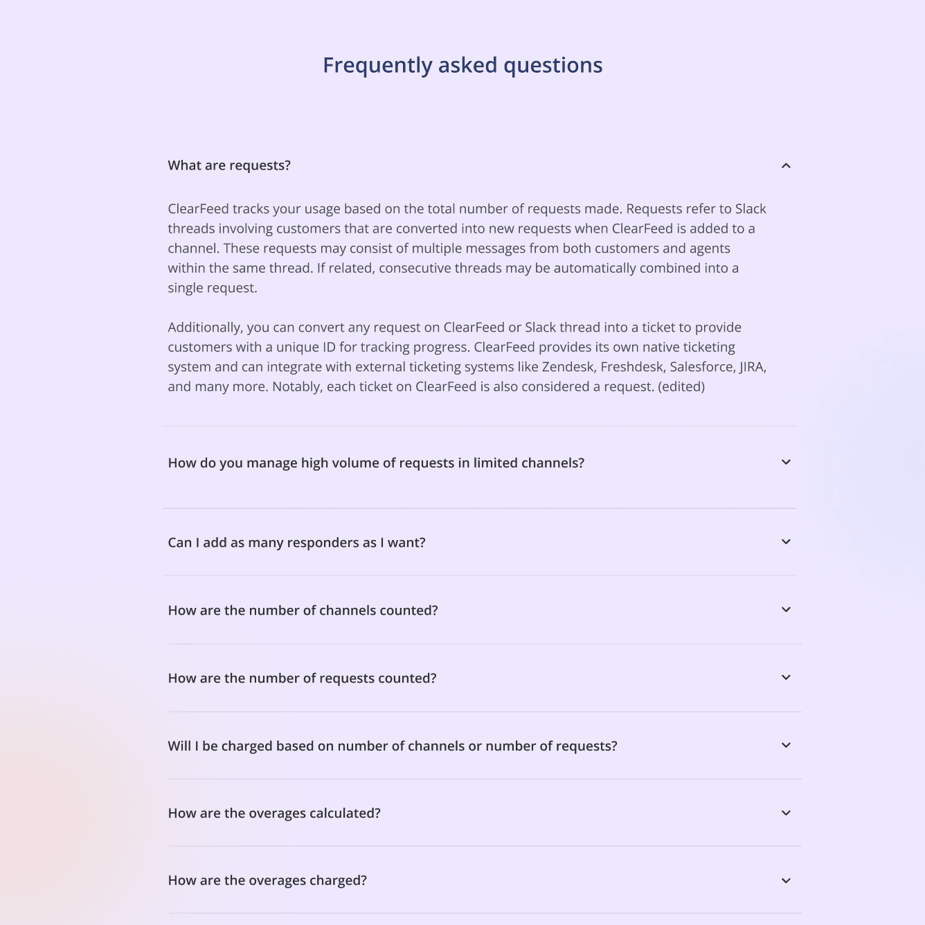
Another exciting page I worked on is Pricing Page. It had the second most views after the home page. Since there was no pricing page earlier, I built it from scratch. Page Overview: It would have various plans like Free Plan, Professional and Enterprise plan with different features. There will be discounts for small businesses. There will be an FAQs section for general questions of visitors.


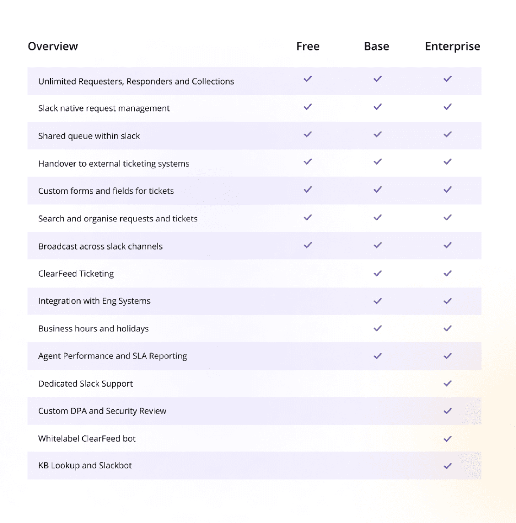
There were a lot of iterations to choose from on this page. Some examples are given below.

Features in Laundry List

Nobody would actually read such a long list

Much more readable and can be interpreted more easily

Features inside Box

Features in Laundry List

Nobody would actually read such a long list

Nobody would actually read such a long list

Much more readable and can be interpreted more easily

Much more readable and can be interpreted more easily

Features inside Box

Base

Features in Laundry List

Nobody actually read such a long list

Features inside Box

Nobody actually read such a long list

This is regarding giving a discount to small businesses.

This is regarding giving a discount to small businesses. Used toggle since it is used for actions or options that have an immediate effect on the UI.

Toggle ✅

Toggle ✅

Used toggle since it is used for actions or options that immediately affect the UI.

Used toggle since it is used for actions or options that immediately affect the UI.

In this case, whether they are considered startups or not would arise.


And enterprises would ask, "Why is this bias?" and wonder if this company targets startups.

In this case, whether they are considered startups or not would arise.

And enterprises would ask, "Why is this bias?" and wonder if this company targets startups.

Checkbox

Checkbox

This eliminates the first question, and it is clear that we are trying to help small businesses, which is why this discount is there.

This eliminates the first question, and it is clear that we are trying to help small businesses, which is why this discount is there.

The other part was regarding the content. One option was writing Corporate and Startup. But in this case the question would arise if they are considered startup or not.

And enterprises would say, “Why is this bias?” and wonder if this company is specifically targeting startups.


Second option is to use Most businesses and Small Businesses. This eliminates the first question and is clear that we are trying to help small businesses that is why this discount is there.

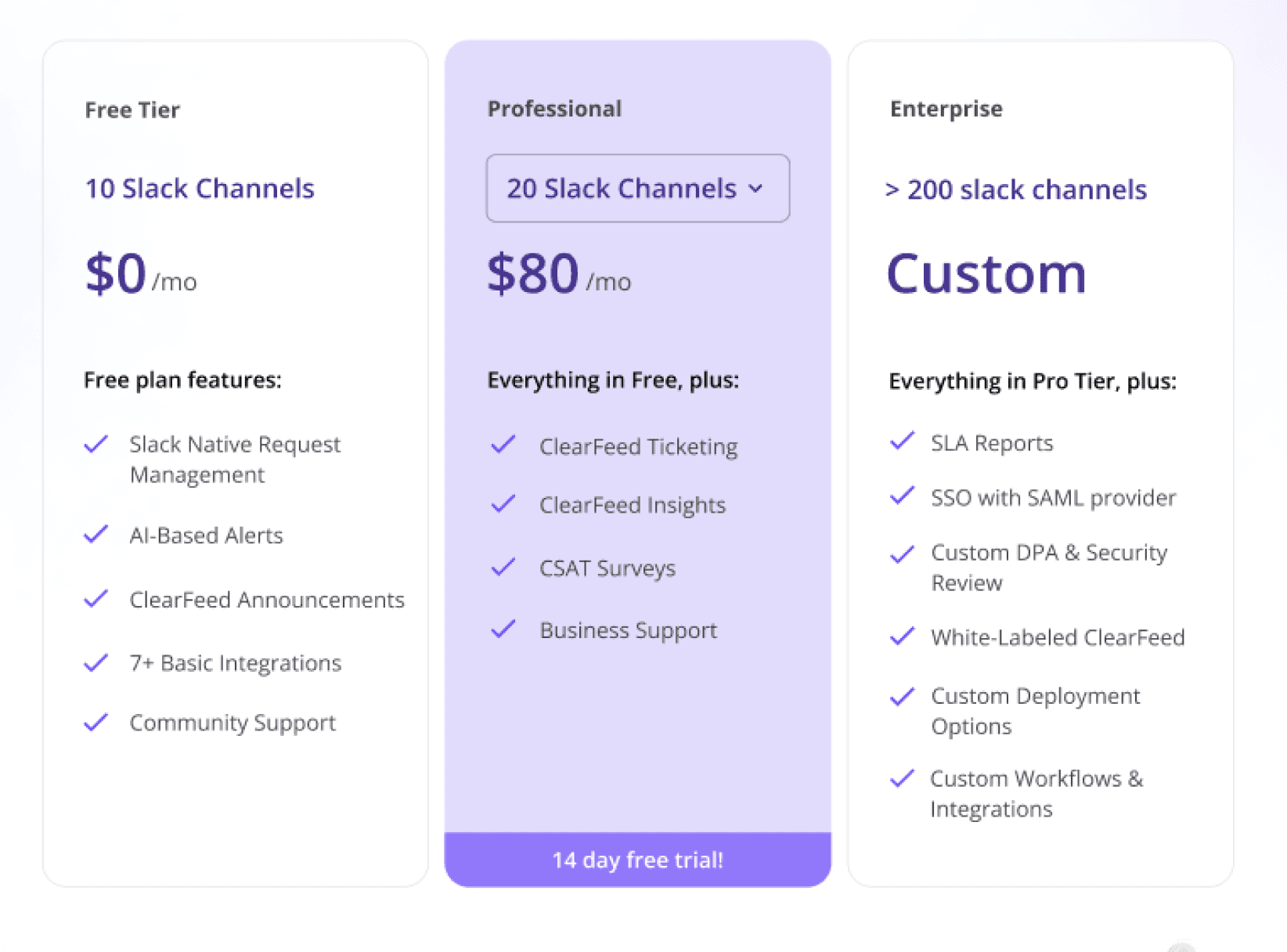
This is how ClearFeed pricing looks like, Below i have shown the iterations which followed.

ClearFeed Pricing

For External Support

For External Support

Product name is Customer Slack Channels

Product name is Customer Slack Channels

Product name is Internal Helpdesk

Product name is Internal Helpdesk

Pricing based on number of channels

Pricing based on number of requests

For Internal Support

For Internal Support

First Iteration

Most of the things we had done right. But we tried to package channels and requests together as a ClearFeed Unit(CLU), and this didn't work. Even the internal team couldn't understand it.

First Iteration

Most of the things we had done right. But we tried to package channels and requests together as a ClearFeed Unit(CLU), and this didn't work. Even the internal team couldn't understand it.

Most of the things we had done right. But we tried to package channels and requests together as a ClearFeed Unit(CLU), and this didn't work. Even the internal team couldn't understand it.

Second Iteration

Second Iteration

Second Iteration

We separated both use cases and used tabs to navigate between them. This made it very clear and understandable. We used Customer Slack Channels as Default since it is the most prominent use case.

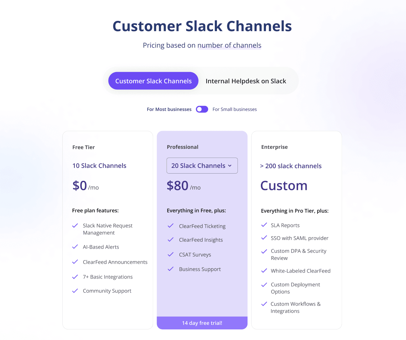
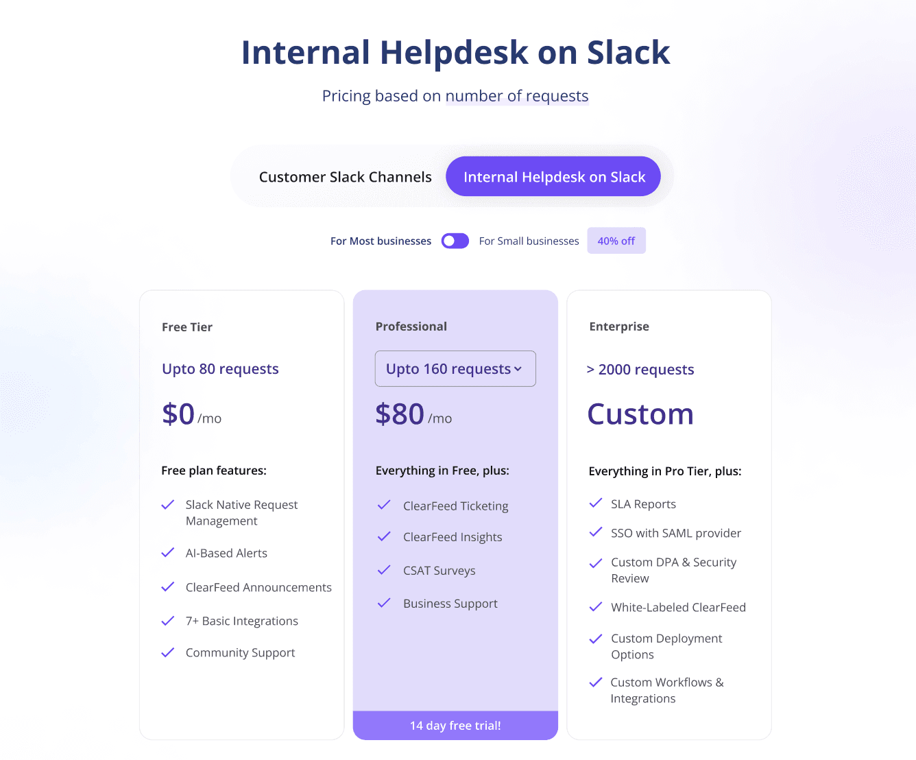
Feedback for the previous version was some people didn't notice Internal Helpdesk and assumed the pricing of Customer Slack Channels was Internal Helpdesk. We can't even confirm with the data since both were on the /pricing page itself. This was Problematic.

So we created two pages,/pricing/customer-slack-channels and /pricing/internal-helpdesk, and introduced these two options in the dropdown in the pricing menu. And made another page at index /pricing where you can understand them, choose one, and go to the respective page.

Final Version

Pricing

This solved all the problems, and this was our final version. After this, the customers had almost negligible queries, and they figured it out.

This solved all the problems, and this was our final version. After this, the customers had almost negligible queries, and they figured it out.

Results

Final Version

  • Users find their use case quickly and feel more confident about ClearFeed while booking a demo. Many customers started to try out products directly from the website.

  • The number of organic traffic significantly increased. This could be because of the proper structure we have given to the website and SEO optimisation.

  • Time spent per session also increased.

  • The percentage of demos books increased.

  • People started to try the product independently, which never happened before.

  • The percentage of queries and doubts decreased.

This solved all the problems, and this was our final version. After this, the customers had almost negligible queries, and they figured it out.

Results

  • Users find their use case quickly and feel more confident about ClearFeed while booking a demo. Many customers started to try out products directly from the website.

  • The number of organic traffic significantly increased. This could be because of the proper structure we have given to the website and SEO optimisation.

  • Time spent per session also increased.

  • The percentage of demos books increased.

  • People started to try the product independently, which never happened before.

  • The percentage of queries and doubts decreased.

Other Work

Work on many other pages, including revamping the existing pages according to the current theme and structure. One notable page to mention is "Halp Alternative". We were one of the first companies to build how ClearFeed could replace Halp as its alternative when Halp got closed. Later many companies copied almost the same stuff. XD Apart from this, I even worked on animations of various features on different pages. Created various pages like Features Page, Support Page, Thank you Page, Use Case Page, Book a Demo Page, etc. Also made blog and case studies cover images.

Feedback from the team

I am grateful for the positive feedback and encouragement from my team members. They commended my creativity and attention to detail, which played a crucial role in revamping the website's user interface. Their appreciation motivated me to strive for excellence and contributed to a collaborative and enjoyable work environment.

Conclusion

In conclusion, the website design project undertaken during my internship at ClearFeed has been a rewarding experience. Throughout the project, I learned the importance of collaboration and the impact of user-centric design decisions on overall business success. I am grateful for the guidance and support from my team and mentors during this internship. The insights gained from this project will undoubtedly shape my approach to future website design endeavours. I sincerely appreciate the entire ClearFeed team for this invaluable learning experience.

Go to Home

Created on late nights, fuelled by coffee, and made with love

Created on late nights, fuelled by coffee, and made with love

Created on late nights, fuelled by coffee, and made with love