
What does Curelink do?
It is a recent startup that started around two years ago. I assume that you are not aware about it. So let me explain it to you. Curelink is a health tech startup aiming to give doctors the resources to provide holistic care. Patients can be enrolled in the app, and doctors provide care with live sessions and WhatsApp support. One way is for doctors to enrol the patients. The other way of enrolling patients is through a coordinator or if the patient themselves scans QR codes. After the patient enrols, the patient can register and pay in the app for better care.


In this project, I worked on providing incentives to the Coordinator to enrol the patients. Because the salary of the Coordinator is usually low, it would be easy to motivate him to enrol patients. Also, he would have more free time, so he could take hustle for installing QR codes throughout the hospital. I was the only designer for the project. The timeline was roughly two weeks, and I worked closely with 2 product managers on the project.


The Coordinator would not be very tech-savvy.
They would be earning a low salary of 10k- 20k.
The age would be around 25-40 years.
High Level Brainstorming
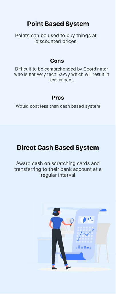
We want to build a simple solution which is easily understandable by coordinators. We could show rewards on enrolling and then showcase all of them in a dashboard. That is the usual flow we decided to go ahead with. For the Rewards, it could be coins or some other intangible identity. Still, we decided to keep everything simple and give them direct cash awards of 2-5Rs. And if the patient becomes a customer by paying, we can provide 5-50Rs. The most usual and known format of revealing rewards could be scratch cards.


Integrated with Initial App
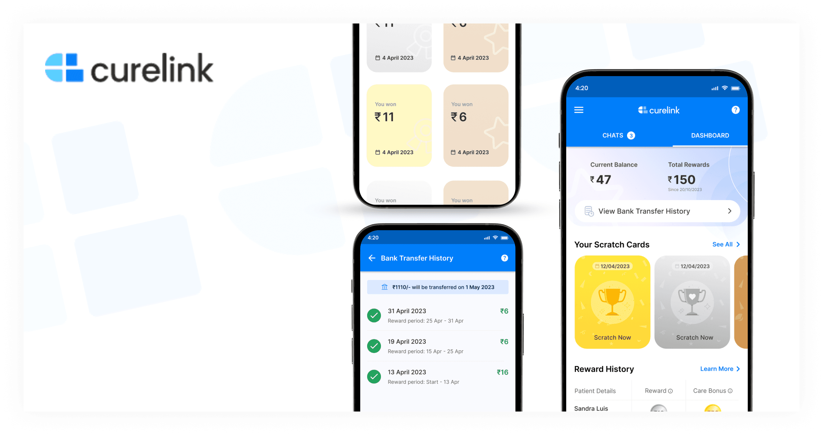
Our solution must be compatible with the existing app of Curelink. One is the Home screen, where all the patient's chats are present and are enrolled. There is a button to enrol patients. To enrol one, add the number and select the care plan, and the patient is enrolled. The left hamburger shows the profile and settings.


Design System
I introduced Gold, Silver and Bronze colours since they were required for scratch cards.


I followed an iterative approach when it came to finally creating the interface. I took regular feedback from the stakeholders to ensure I worked at par with their expectations.
Revealing the stratch card
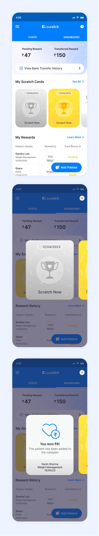
There are two options to show that you have won a scratchcard: one is with the help of the snack bar on the home screen, and the second is continuing the flow from the success screen itself and having a fixed strip on the top of the home page to show the scratchcard. We decided to go with the second option since it would continue the flow and be always visible, so there are more chances of clicking.


Dashboard


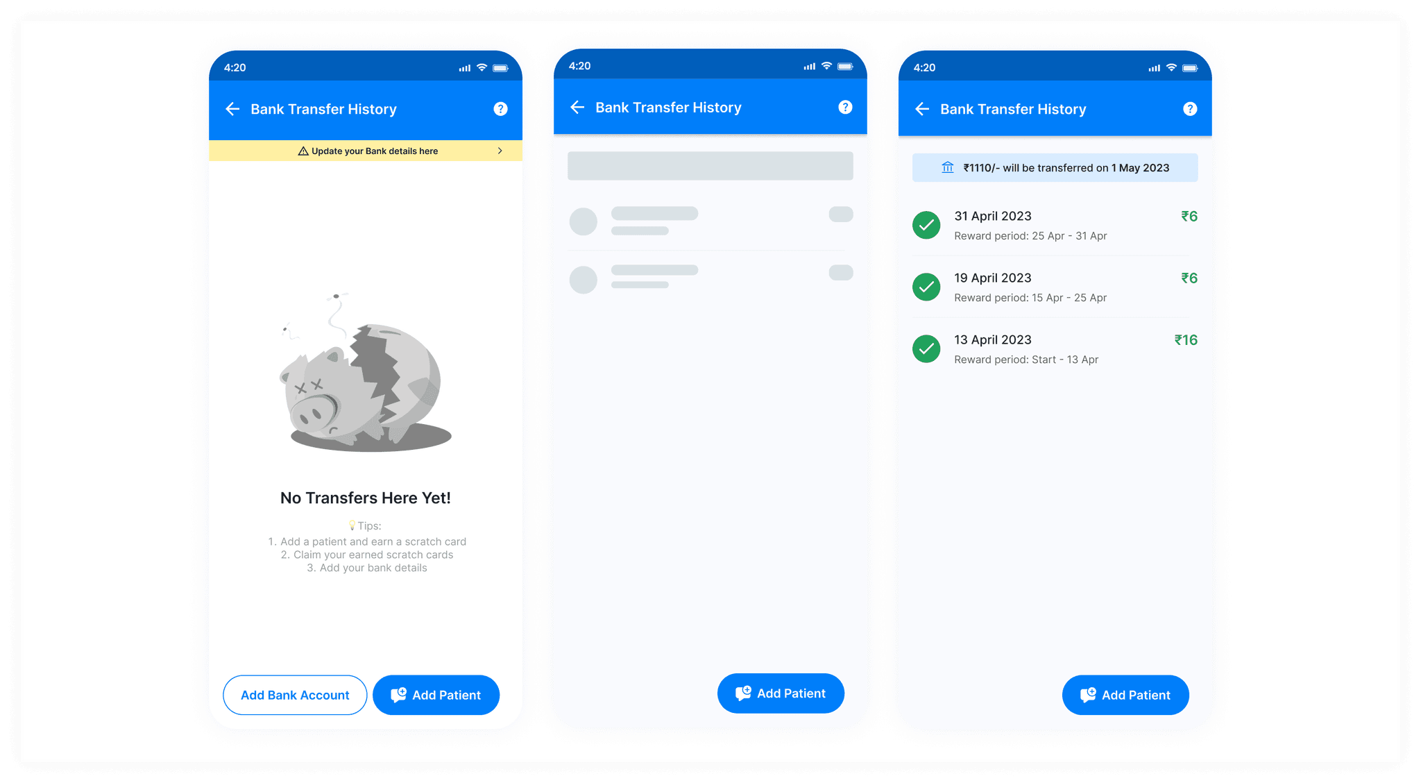
I worked on the UI Part, and this is how it came out after a few trials. I decided to provide more explicit CTA's like "View Bank Account History", "See All", and "Learn More". I also created the empty states for this screen, shown in further sections.

View Bank Transfer History

How to earn stratchcards


View all Scratch Cards


Other Edge Cases
Below are the edge cases like when the daily, hourly limit of enrollment of patients is crossed. Or when it is out of a valid time slot. Clicking on "Know more" shows the enrollment rules.


I organised the file into various sections of screens and different animations and components. And I also took feedback from other members of my team. They were happy with the latest version but gave specific feedback for me to improve. These are certain things that I learnt and improved upon.
Apart from the usual flow, I learnt about thinking of edge cases and other possible flows and creating loading states, empty states and first-time user experience screens.
I learned to manage my time effectively by setting realistic deadlines and sticking to them.
I understood the importance of being flexible and adapting quickly by being prepared to change your designs or schedule. And be willing to go the extra mile to make your client happy.
My freelancing product design project was a collaborative success, guided by two experienced product managers. Working closely with them, we created an innovative product design that addressed user needs and received positive feedback. The team was also happy with my work. This experience reinforced the importance of teamwork and effective communication, motivating me to continue honing my skills in product design for future endeavours.
Go to Home


