
MY ROLE
Product Designer
MY RESPONSIBILITIES
Problem identification | Idea brainstorming | Empathising with user persona | Creating user flows | Wireframes | UI Design | UI components to Design System
MY TEAM
1 Product Manager
1 Researcher
Few Developers
STAKEHOLDERS
Aman Singla (CEO)
Divyansh Jain (CTO)
TIMELINES
Very strict timeline of 2 weeks
BUSINESS CONSTRAINTS
Quick and easy to build
PLATFORM
Mobile App (ios/android)
CONTEXT SETTING
What does Curelink do?
What does Curelink do?
Curelink is a health tech startup aiming to helps doctors provide AI Powered Holistic Care improving clinical and business results under their own brand. Patients can be enrolled in the app, and doctors provide care with live sessions and WhatsApp support. See more about Curelink here
Curelink is a health tech startup aiming to helps doctors provide AI Powered Holistic Care improving clinical and business results under their own brand. Patients can be enrolled in the app, and doctors provide care with live sessions and WhatsApp support. See more about Curelink here


Curelink is trusted by
With the vision of making healthcare convenient for everyone, Curelink is growing very fast and has seen many success stories. Receiving positive feedback from both doctors and patients, Curelink is on its way to expand and reach more number of patients.
With the vision of making healthcare convenient for everyone, Curelink is growing very fast and has seen many success stories. Receiving positive feedback from both doctors and patients, Curelink is on its way to expand and reach more number of patients.


THE PROBLEM
Increasing number of patients taking support from Curelink
Increasing number of patients taking support from Curelink
The brief was to increase number of enrolments and conversions in the app in order to increase the number of patients taking support from Curelink. Enrolment means when a patient is added to the care-plan for the free trial. A patient can self enrol by QR codes hanging the hospital or by enrolment from doctor or coordinators.
The brief was to increase number of enrolments and conversions in the app in order to increase the number of patients taking support from Curelink. Enrolment means when a patient is added to the care-plan for the free trial. A patient can self enrol by QR codes hanging the hospital or by enrolment from doctor or coordinators.
Ways of enrolment
Self enrolment by scanning QR codes
Self enrolment by scanning QR codes
Enrolment by doctor/ coordinator in their app
Enrolment by doctor/ coordinator in their app


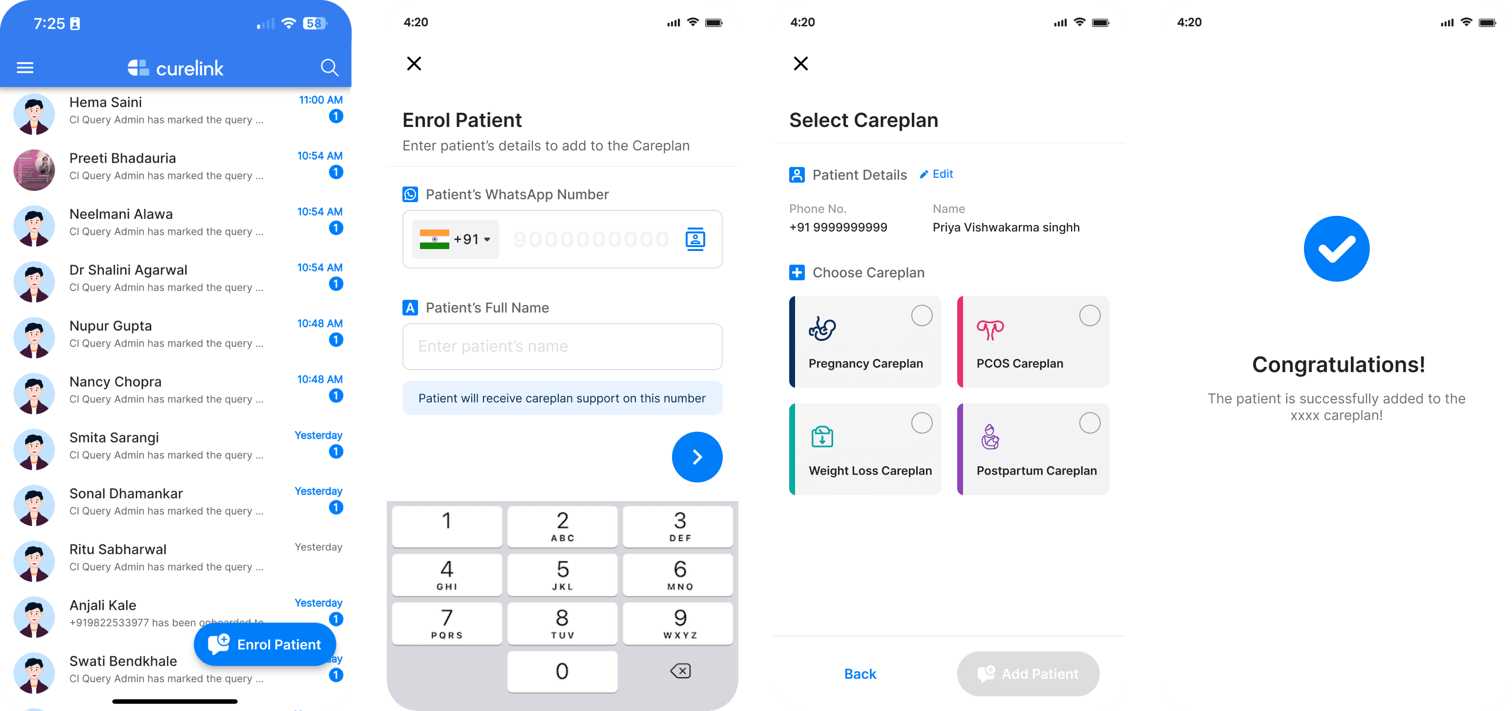

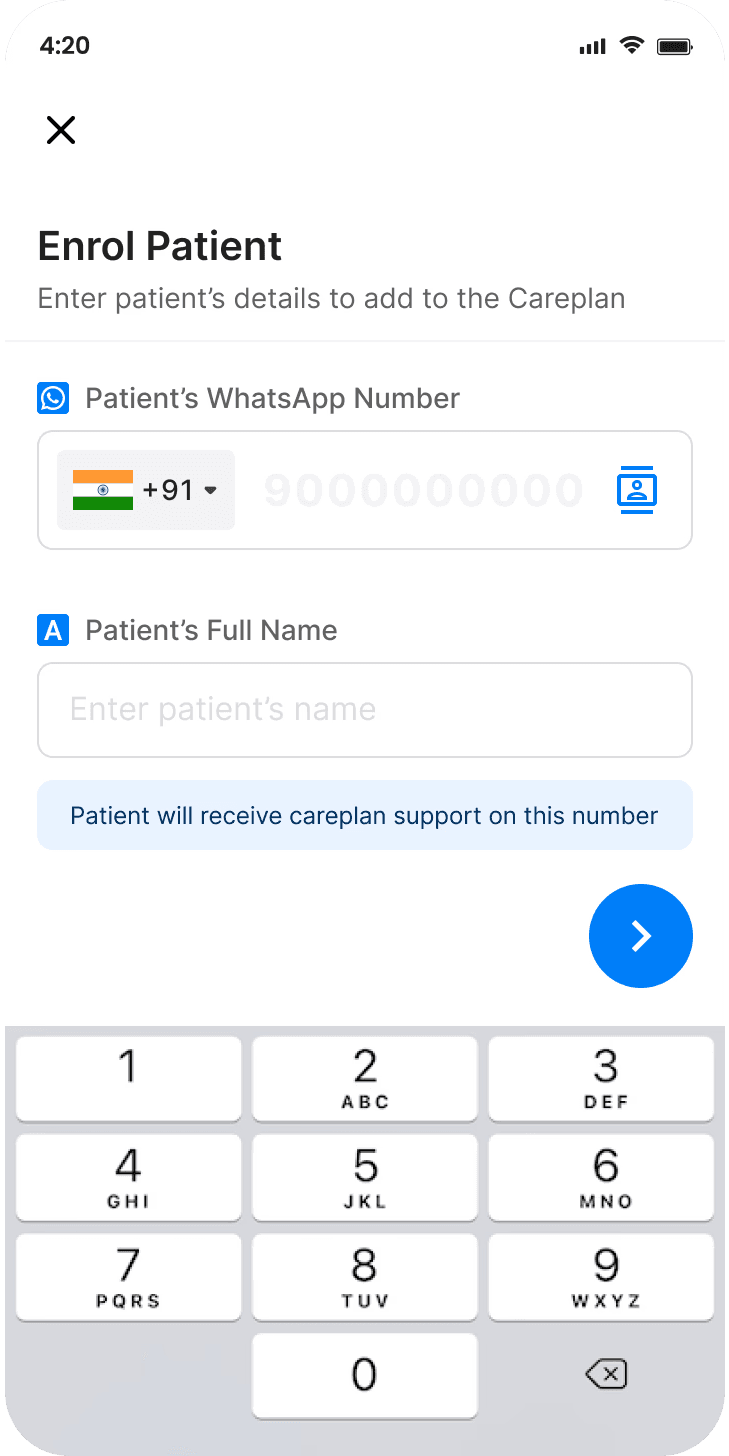


Conversion means when the person pays while using or on completion of free trial. Conversion depends upon how much value the patient is drawing from it and how well the doctor or coordinator has sold the plan.
Conversion means when the person pays while using or on completion of free trial. Conversion depends upon how much value the patient is drawing from it and how well the doctor or coordinator has sold the plan.
ANALYSIS
Drawing insights from Data
Drawing insights from Data
Enrolment flow looks simple and straightforward. Then why is enrolment number less? To validate this hypothesis and get more more insights, I looked into data. This data is for all different types of hospitals, in some of which enrolment is completely done by doctors or just coordinators or both.
Enrolment flow looks simple and straightforward. Then why is enrolment number less? To validate this hypothesis and get more more insights, I looked into data. This data is for all different types of hospitals, in some of which enrolment is completely done by doctors or just coordinators or both.


There are less enrolments which even get start.
Completed enrolments by doctor is 44%, coordinator by 27% & QR code is 29%
86% who start enrolling complete it.
✅
❌
🔍
The data validated that the problem for less enrolments is not because of some issue with flow of enrolment but the issue is something else. To dive more into this, I tried to understand and emphasise with the user personas of doctors and coordinator who are primarily responsible for enrolling the patients.
The data validated that the problem for less enrolments is not because of some issue with flow of enrolment but the issue is something else. To dive more into this, I tried to understand and emphasise with the user personas of doctors and coordinator who are primarily responsible for enrolling the patients.


Dr. Patel is a highly experienced GP with a focus on preventive care. He runs a small clinic in Delhi. He is tech-savvy & believes in using digital tools to enhance patient care & streamline his practice.
Pain points
Administrative tasks, taking time away from direct patient care
Lack of consistent engagement with patients between visits
Goals
To be able to understand and serve customers better.
To keep patients engaged with their health.
Motivations for enrolment
Better Retention
Additional Revenue
Better customer care

NAME:
Dr. Raj Patel
AGE:
38
EDUCATION:
AIIMS, Delhi
JOB:
General Practitioner (GP)
User persona of coordinator
User persona of coordinator


Aditi Sharma is a medical coordinator at Dr. Maya Patel’s clinic in Delhi. Her role involves managing patient appointments, coordinating communication, handling medical records.
Pain points
She feels, her time is not properly utlised.
Earns only around 20k, which is a concern to her
Goals
Handle patient queries, reminders, and follow-ups
Maintaining patient records and managing clinic supplies.
Motivations for enrolment
Coordinators are not intrinsically motivated to enroll patients

NAME:
Aditi Sharma
AGE:
28
EDUCATION:
CMAA
JOB:
Medical Coordinator
Target Persona and Future Direction
Target Persona and Future Direction
Since the enrolment ratio of coordinators is low due to their lack of intrinsic motivation, the target audience would be the coordinators.
For this kind of problem, we have seen many case studies where gamification and rewards help solve it. Additionally, coordinators' income is low, so it would be feasible to motivate them to increase enrolments and conversions.


Target Persona- Coordinations
Future Direction- Gamification
🙋♂️
🎁
FINAL PROPOSAL
Solution
Solution
Creating reward system to create intrinsic motivation for coordinator to do more enrolments & sell better for more conversions
Creating reward system to create intrinsic motivation for coordinator to do more enrolments & sell better for more conversions
If I had more time, I would have loved to explore different ways to get this done. However, since we were constrained and the major stakeholders were aligned on trying this approach, we took a mental shortcut and decided to proceed with it. It may not have been the best way, but perhaps it was the most practical given the tight deadline.
If I had more time, I would have loved to explore different ways to get this done. However, since we were constrained and the major stakeholders were aligned on trying this approach, we took a mental shortcut and decided to proceed with it. It may not have been the best way, but perhaps it was the most practical given the tight deadline.
SEEING INSPIRATION AND MARKET TRENDS
INSPIRATION
Apps using gamification
Apps using gamification
Since, I never worked much on this before, I spend some time understanding how gamification concept is being used in other apps. Some of the apps I explored were Google pay, Paytm, CRED, Piggy, Jar etc. I identified common patterns such as scratch cards for rewards, coupon offerings, virtual coins or cash incentives, and visual representations of transferred amounts.
Since, I never worked much on this before, I spend some time understanding how gamification concept is being used in other apps. Some of the apps I explored were Google pay, Paytm, CRED, Piggy, Jar etc. I identified common patterns such as scratch cards for rewards, coupon offerings, virtual coins or cash incentives, and visual representations of transferred amounts.


BRAINSTORMING AND USER FLOWS
IDEATION
High level Brainstorming
High level Brainstorming
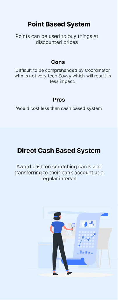
I decided to go with standard method of giving rewards through scratch cards but what kind of reward should be given and when a certain type of award should be given. The following options is what I got to choose from coupons, points or cash. Coupons was not go to option since, they aren’t motivating enough.
From points and cash, the following points were considered before making an opinion.
Point Based System
Pros
Points can be used to buy things at discounted prices or after
Cons
Difficult to be comprehended by Coordinator who is not very tech Savvy which will result in less impact.
Would cost less than cash based system
✅ I decided to go with cash based system
Award cash on scratching cards and transferring to their bank account at a regular interval
Direct Cash Based System

User Flows
User Flows
After analysing all the 6 combinations, I finalised this, for maximising conversions and enrolments. The following combination was decided-
On Conversions- Gold Scratch Card
On QR Code Enrolments- Silver Scratch Card
On Coordinator App Enrolments- Bronze Scratch Card
After analysing all the 6 combinations, I finalised this, for maximising conversions and enrolments. The following combination was decided-
On Conversions- Gold Scratch Card
On QR Code Enrolments- Silver Scratch Card
On Coordinator App Enrolments- Bronze Scratch Card


SOLUTION
Winning Scratch Card
Winning Scratch Card
Made two iterations for the same.
Made two iterations for the same.


Dashboard
Dashboard
Before the final versions, I explored a few options & then decided which would best meet our requirements.
🚫🚫 These are not UI screens 🚫🚫, but initial explorations focused on layout & hierarchy. Since I was working with PMs who had difficulty understanding wireframes, I created slightly coloured wireframes to make them easier to follow.
Before the final versions, I made few explorations and then decided on which one will will go best with our requirements and our user persona. 🚫🚫🚫 These are not UI screens 🚫🚫🚫, these are initial explorations made for decided on the layout and heirarchy, since I was working with PMs who have hard time understand wireframes, so I made slightly colored wireframes for them to understand.


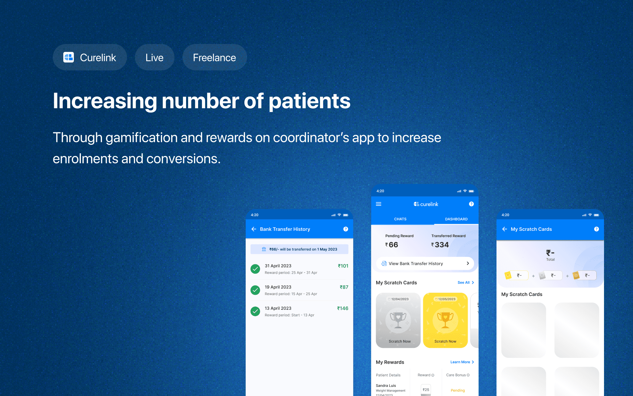
After finalising on the layout, I did the UI part. Final dashboard screens: Replaced the hamburger menu with a tabbing structure for better accessibility, made "View Bank Transfer History" more prominent, and cleaned up the "My Rewards" section with a table.
Considering our target audience (coordinators aged 25-50), I ensured text is readable, with smaller text bolded for clarity.
Then I after finalising on the layout by taking feedback, I did the UI part. The final screens of dashboard. Did few changes like introduced a tabbing structure instead of hamburger considering the fact that it is more accessible. Made the “View Bank Transfer History” more prominent after reconsidering its importance. And made the my rewards section more clean by introducing a table.
Our target audience, coordinators aged 25 to 50, may have difficulty reading small text. To ensure accessibility, I’ve kept the text size readable, and when smaller text is used, it’s bolded for clarity.

Clicking on the top CTA named “View Bank Transfer History” opens this screen.
Clicking on the top CTA named “View Bank Transfer History” opens this screen.

The empty state and the loading state which includes a shimmer over the UI components.
The empty state and the loading state which includes a shimmer over the UI components.
Also attached the empty state and the loading state which includes a shimmer over the UI components.


Clicking on CTA named “See All” besides the scratch cards shows all the scratch cards opened and unopened.
Clicking on CTA named “See All” besides the scratch cards shows all the scratch cards opened and unopened.


First-Time User Experience
First-Time User Experience
Designing the First-Time User Experience for the Dashboard, addressing Empty States and How to Earn Rewards.
Designing the First-Time User Experience for the Dashboard, addressing Empty States and How to Earn Rewards.

Showcasing “How rewards work” for the user first time opening dashboard is crucial so that users actually learns about the reward system. Here is the first and the second iteration-
Showcasing “How rewards work” for the user first time opening dashboard is crucial so that users actually learns about the reward system. Here is the first and the second iteration-


These a
Edge Cases
Edge Cases


These are introduced to make sure that coordinator is not enrolling random names and numbers to earn money, so that’s why enrolment is limited in office hours, with permission of specific numbers in day and hours.
Other edge cases- These are introduced to make sure that coordinator is not enrolling random names and numbers to earn money, so that’s why enrolment is limited in office hours, with permission of specific numbers in day and hours.


These a
Microanimations
Microanimations
Some of the micro-animations which I created to make the experience more engaging were as follows
Some of the micro-animations which I created to make the experience more engaging were as follows


THAT’S IT
That’s the wrap
That’s the wrap
I then handoff the designs and assets to the developers. I was happy to know that as much as I enjoyed working with Curelink, they also enjoyed working with me. This was the saying of the PM I closely worked with:
I then handoff the designs and assets to the developers. I was happy to know that as much as I enjoyed working with Curelink, they also enjoyed working with me. This was the saying of the PM I closely worked with:


“Rupam's ability to turn ideas into high-fidelity designs quickly is impressive. Her user-focused approach and attention to detail made a big impact on the final product. I look forward to collaborating with her again.”
Success Metrics
Success Metrics
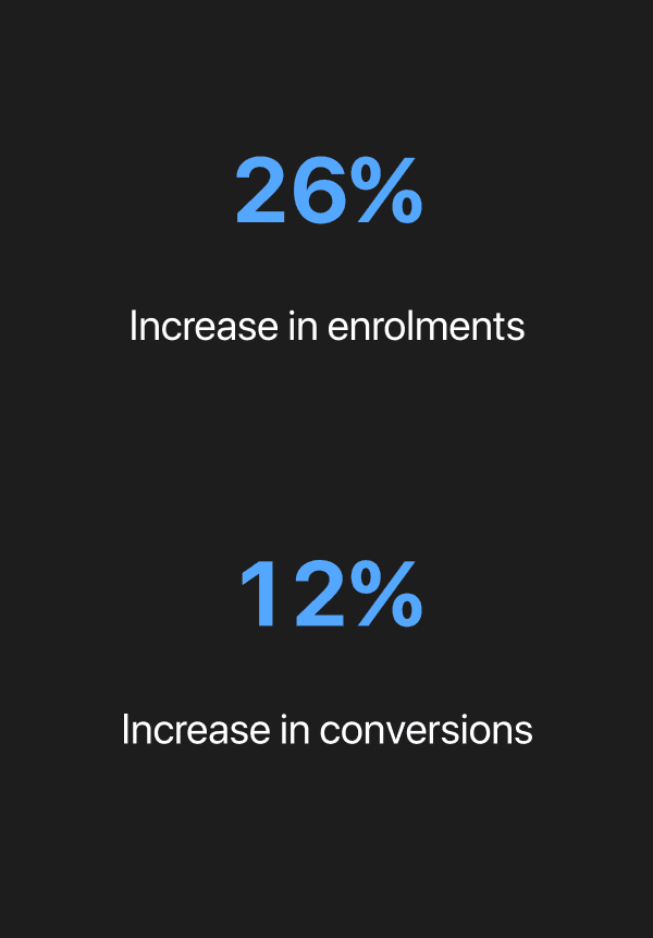

After few months when I talked to one of the team member approached me for another project, I got the opportunity to ask about the success of this project. I was glad to know that this project lead to
After few months when I talked to one of the team member approached me for another project, I got the opportunity to ask about the success of this project. I was glad to know that this project lead to
26%
12%
Increase in enrolments
Increase in conversions
Learnings from the project
Learnings from the project
This was my first freelancing project and with such a tight deadline, it left me with lots of learnings. Some of which were-
I learned to manage my time effectively by setting realistic deadlines and sticking to them.
I understood the importance of being flexible and adapting quickly by being prepared to change your designs or schedule. And be willing to go the extra mile to make your client happy.
One might not have the leverage of the best resources, but effectively utilising whatever one have goes a long way.

MY ROLE
Product Designer
MY TEAM
1 Product Manager
1 Researcher
Few Developers
BUSINESS CONSTRAINTS
Quick and Easy to Build
TIMELINE
2 weeks
PLATFORM
Mobile app (ios/andriod)
Interested in more?
Interested in more?
Explore my other case studies
Explore my other case studies


ClearFeed
Live Project
Revolutionised customer support on Slack by automating repetitive queries
Designed a system where support team can index, text & activate the data source.

Most appreciated self project
Improved balance between physical appearance and personality on Tinder
Designed nudges which help form deeper connections.


Xalts
Live Project
Enhanced Security and Compliance with web-based wallet Integration
Increased user trust and drove 20% Growth in Institutional Clients.

Enhanced Security and Compliance with web-based wallet Integration
Increased user trust and drove 20% Growth in Institutional Clients

Xalts
Live Project

Revolutionised customer support on Slack by automating repetitive queries
Designed a system where support team can index, text & activate the data source.

ClearFeed
Live Project

Improved balance between physical appearance and personality on Tinder
Designed nudges which help form deeper connections
Most appreciated self project

